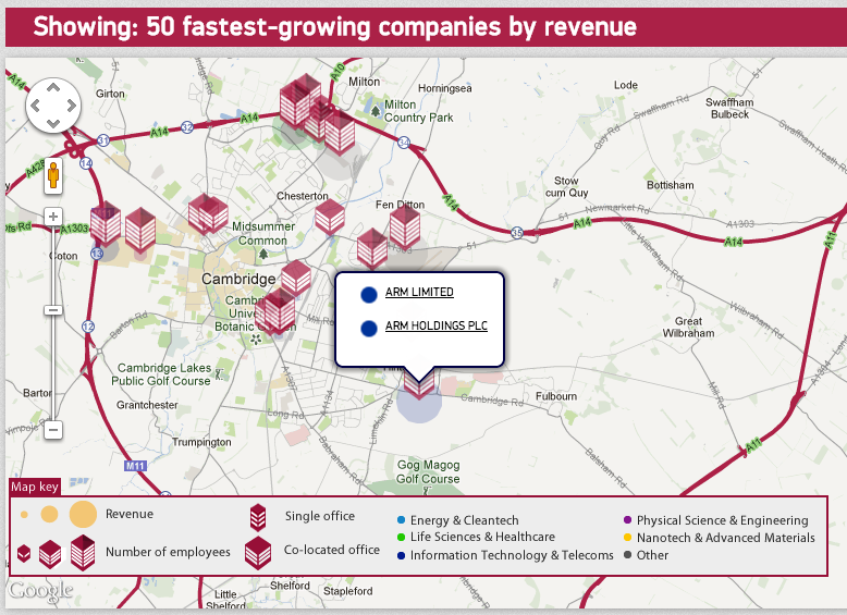
Why we like it: The Cambridge Cluster Map is a simple, visually appealing map that shows off the power of using a map to make a meaningful data visualization. According to their site, “The Map is designed to open the Cambridge technology cluster to the world. Through visualisations, reports and directories the Map paints a vivid picture of the business community that’s grown up over forty years.“

The map uses Circles, custom icons, InfoWindows, and Styled Maps to show data in various data sets, including fast growing companies, billion dollar companies, spinouts from Cambridge University, and much more.
One interesting feature is the use of circles, which the map places under a marker to show the amount of revenue generated in that location. The bigger the circle, the bigger the revenue.
The custom icons serve double purpose, showing both the number of employes and the kind of building, with multiple companies or a single one.
All in all a beautiful map which also manages to convey a lot of information.
Posted by Mano Marks, Maps Developer Relations Team